While it’s true that looks aren’t everything, when it comes to your proposal format, appearance is important. Visual appeal is often overlooked, but it shouldn’t be. The way your RFP response looks impacts how your potential client feels about your company. A properly formatted proposal is more approachable, engaging and effective. Consequently, paying attention to proposal formatting pays off.
I’ve worked on countless proposals and RFP presentations in my career. Frequently, I find myself adjusting the same things. So, the big question is: What should a proposal look like? To help, I wanted to share some tips to help you view your proposals from a design perspective.
In this blog, I’ll start by offering some things to think about when considering your proposal format. In addition, I’ll offer 11 tips for creating visually appealing proposals. And finally, I’ll share my favorite tools to help. Armed with these tips and tools, you’ll understand how these small adjustments make a big impact.
Things to remember when thinking about formatting
As you read through the tips below, there are a few things you should keep in mind. The format of your proposal should always support your end-goal. Naturally, that goal is to help a potential customer decide that your business is the best choice. Some of the suggestions may seem small, but every little advantage counts.
What proper proposal formatting can do
Make a positive impression
Your business did a lot of work to get this RFP, so the response should capitalize on the good impression you’ve already made through capture management. Consequently, the proposal design should reinforce your brand, professionalism and reputation. In addition, the way your RFP response looks can communicate that your company is easy to work with and understands what the buyer needs.
Encourage evaluators to actually read your proposal
Sadly, most of the people who will see your proposal won’t actually read it. It’s unfortunate, but true. In the best case scenario, your proposal will be one of three options but at worst, one of dozens. As an evaluator, no matter how short the RFP is, evaluation is a daunting prospect.
Naturally, the first review of an RFP response is quick. Several of the tips below are designed to grab attention and turn the procurement manager’s impulse to skim and scan into a positive.
Advance to the shortlist and win the business
Ultimately, the quality of your proposal content should be compelling enough to win the business. However, as any person who evaluates proposals regularly can tell you, there are little things that can work against you.
It may seem unfair but typos and inconsistency are a distraction. In addition, they communicate carelessness, a lack of attention to detail and an inability to execute. Certainly, those qualities aren’t often associated with winning proposals.
11 tips for appealing proposal formatting
Note: If there’s a tool that applies directly to the tip, click the [tool] text to jump directly to it in the tools section.
1. Pick your font with purpose
To kick off, let’s talk about fonts. It’s a little thing, but not all fonts are created equal. Don’t think it could possibly make a difference in your proposal? Check out this example:
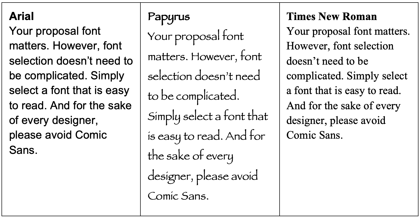
All three of these fonts are well known and available in Microsoft Word. Each is 12-point and has the same line spacing, but the difference is remarkable. Not only do some fonts pose a page-limit challenge, but imagine having to read an entire proposal in Papyrus. My eyes are exhausted just thinking about it.
If your RFP response will likely be distributed by the issuer digitally, I recommend a sans serif font, like Arial. While the debate is ongoing, generally designers believe that these simple fonts are best for digital reading. The reason is interesting (at least to a designer) and you can read more about it in this article.
On the other hand, if you know your proposal will be printed or you must submit a hard copy, a serif font may be the right pick. Books and newspapers are typically printed in a serif font, like Times New Roman, so readers are comfortable with the style. Interestingly, it is estimated that Times New Roman uses 27 percent less ink than Arial. So, if you often submit hard copies of long proposals, it’s a reliable pick that looks good and saves you money.
2. Stick with a style [tool]
As I mentioned above, consistency counts. While I don’t have a strong opinion about the Oxford comma, your entire proposal should follow the same style. After all, the last thing you want to do is distract an engaged reader from your message.
When working with several authors and subject matter experts (SMEs), you’ll likely receive content that has a variety of appearances. From page layout to font and everything in between, the proposal design should look the same from front to back. When I review proposals, I always run through this checklist to ensure consistency:
Proposal formatting checklist
- Margins
- Font(s)
- No more than two
- Size and line spacing
- Headers
- Font and size
- Title or sentence case
- Capitalization
- Product or solution names
- Employee titles
- Oxford commas – Yes or no
- Sentence spacing – One or two spaces
- Photos – Style, border, shape
- Charts and graphs – Style, colors, font
- Spelling – International differences
- Lists
- Bullet points or dashes
- Numbers or letters
3. Embrace your brand
Use your proposal format to support your company brand. Part of being memorable is being recognizable. For example, if you have a well-established brand, consider using your company logo, colors, font and images in your proposal format. Not only will it reinforce your brand identity, but it will make your proposal stand out from the stack.
Branded proposal format example
Check out this example of branded proposal formatting from FedEx. Even without looking it up (or reading ahead), I’m sure you could draw their logo and name their brand colors. Accordingly, FedEx leverages their distinctive look in their proposal design. They feature their logo, use brand colors for headers and include photos to make their proposal incredibly easy to spot.
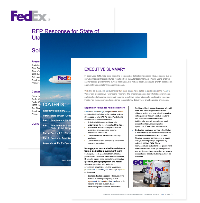
There’s a lot to learn from this proposal format example, and you’ll definitely see it pop up a few more times throughout the rest of our tips.
4. Be concise but nice [tool]
In the world of proposal review and scoring, brevity is a kindness. However, without the benefit of the timing and tone of verbal communication, overly short written responses may be misinterpreted as blunt or harsh. Beyond the challenge of creating a singular voice from a patchwork of input, proposal coordinators must find a balance between cordiality and concision.
Luckily, your RFP cover letter and executive summary present an opportunity to make a human connection. Use these introductory documents to set the tone for the rest of the proposal. Consider mentioning intangible reasons why you’re a good fit. For example, discuss how you can uniquely serve them, your vision for the future and company values you have in common.
Discover helpful downloadable templates including an RFP cover letter, executive summary and more on our resources page.
Within your RFP responses, strive for short sentences and paragraphs. As you read lengthy answers from SMEs, look for compound sentences that can be broken down. From there, you’ll often find that part of the sentence wasn’t necessary. In addition, it is helpful to read the answer and then summarize it to yourself. With the shortest possible answer in mind, it will be easier to communicate the essential facts and remove anything else.
By simple virtue of being easy to read and not overwhelmingly dense, your proposal will be memorable. This goes for paragraphs too. Try to keep things as simple as possible, so your reader isn’t faced with a wall of text.
5. Personalize with pictures [tool]
Proposals don’t have to be a massive block of text. One of the best ways to catch and retain attention is by adding pictures. For example, if your proposal includes short bios for key staff, add a headshot for each. Or, if the RFP requests a customer story or reference, include a photo or logo from that customer.
Images break up your text blocks, are eye catching and help the issuer picture themselves as your customer. However, when you use images, make sure they are relevant, secondary to your content and good quality.
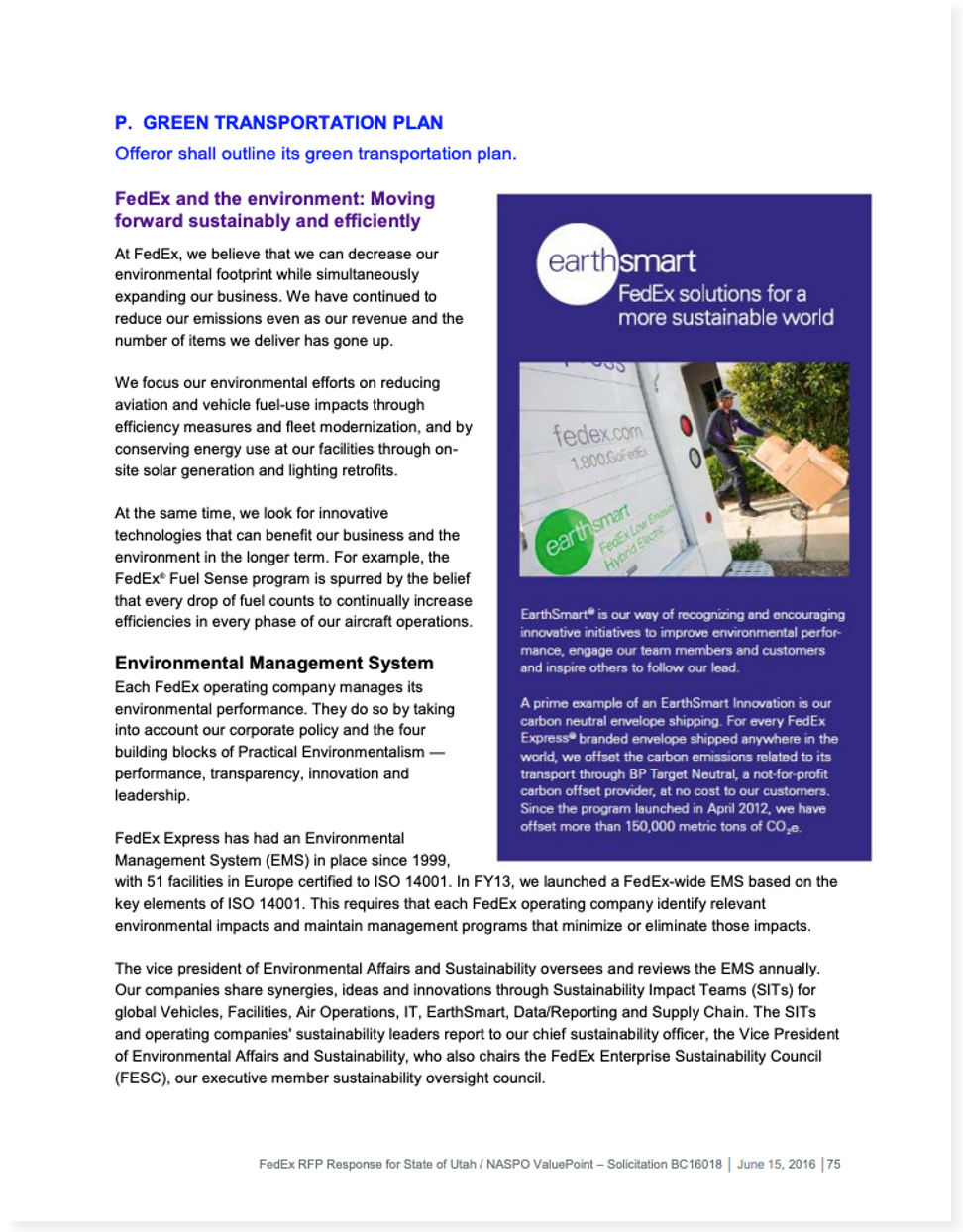
Again, our proposal format example from FedEx does a great job of using images to capture attention. In the image below, the RFP question is about eco-friendly transportation. Their answer includes information about their EarthSmart program. Additionally, it is accompanied by an image of a truck with their EarthSmart logo. The combination makes the idea of green initiatives feel more concrete.
6. Take advantage of video [tool]
If you respond via an RFP software platform, you have a unique advantage. RFP management systems enable you to embed videos into your RFP responses. The applications are endless.
For example: If the RFP asks customer success questions, you can include a short video about the process. Indeed, who better than the department director to talk through the onboarding process while showing how quick and easy it is to access support services? Notably, a minute of video is the equivalent of about 150 words, the equivalent of about a quarter page of text.
To explore the other valuable and time-saving features included in RFP software, download the ebook: Measuring the value of RFP software.
7. Leverage links
In addition to embedding video, proposal software enables you to include links in your responses. Consequently, the resulting proposal is shorter and the person evaluating it has more control.
For instance, a procurement manager may only need the basics about data security protocol, however, when they pass the proposal along to the IT department, a link allows them to dig in further without additional back and forth.
Including links also reduces file sizes. And, it allows the vendor to control access to the information, if necessary. So, even sensitive information can be shared without sending it via email. Ultimately, links allow you to provide additional information without getting bogged down by attachments, addendums and supplemental documentation tacked onto the end.
8. Get creative with charts and graphs [tool]
Let’s face it, spreadsheets are not likely to hold anyone’s attention for long. So, rather than just linking to an attached spreadsheet, create a chart or graph to illustrate your most impactful stats.
Here’s our FedEx proposal formatting example one more time. In a continuation of the question about sustainability, the company further illustrates the results of their efforts. FedEx uses infographic-style visuals to present information in an engaging way.
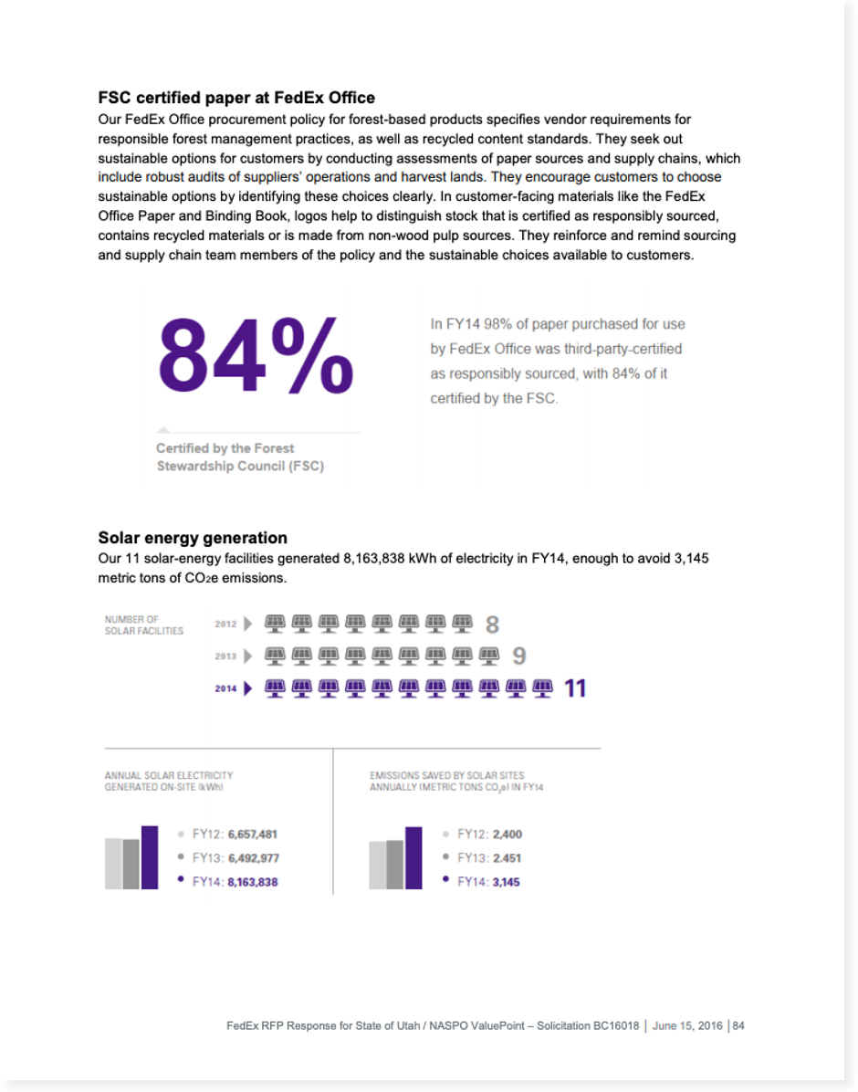
Not only do they tout their accomplishments, but they also share their ongoing goals for the future. Certainly, it’s a powerful statement of their commitment to doing their part for the environment. For companies who prioritize partnerships with companies who share their values, this looks like a winning proposal.
Remember, just like images and video, the charts and graphs you include must be relevant to the RFP question. No matter how tempting it is to shoehorn your best numbers into the proposal, resist the urge.
9. Make it accessible and inclusive [tool]
Assumptions and implicit bias are everywhere you look. But, they shouldn’t be in your proposal. Remember, once you submit, you don’t know who within your potential customer’s organization will need to read and weigh in on your proposal. Accessibility and inclusion are powerful and matter deeply. Here are some easy ways to ensure your proposal can connect with everyone:
Quick tips for proposal accessibility
- Avoid using color combinations that are tricky for people with color blindness
- Don’t use font colors or images that are low contrast
- Add alt text to describe images for people who are visually impaired
A few considerations for inclusive proposals
- Use ‘they’ instead of gendered pronouns when referring to a hypothetical person
- Be sure to feature images that are representative of your diverse company and customer base
- Avoid language may alienate your reader like technical jargon and sports metaphors
10. Follow the requested format
This shouldn’t have to be said, but you’d be surprised how often we hear procurement professionals express their frustration that vendors can’t follow directions. In fact, some are so fed up with it they will automatically disqualify suppliers who disregard RFP instructions. You have to play by the rules. That’s really all there is to it.
11. Review, refresh and revise [tool]
We’ve arrived at our final tip. After spending hours writing, editing and reviewing, it’s important to ask for outside input. I can’t overstate the value of a fresh pair of eyes. Enlist a colleague to be your go-to reviewer. Then, equip them with a proposal style guide (think about using the checklist in Tip 2) to help guide their edits.
First, ask them to scan the proposal, just like the procurement manager will. If they notice anything that looks out of place or doesn’t make sense, make adjustments. Likewise, ask them to briefly skim the answers and point out any inconsistencies or confusing answers. Don’t be afraid to make last minute changes. Better to correct it now and feel confident than wonder after you’ve already submitted it.
Tools for help make your RFP response look like a winner
Now, it’s time to put these tips into action. Here are some of my favorite tools and guides to help you get started creating the perfect proposal design.
Proposal style tools
How to create a style guide
This helpful blog from Venngage explores all of the things that you should include in your style guide as well as examples from tech companies. However, before you start from scratch, check with your marketing team to see if you have a brand guide that might meet your needs.
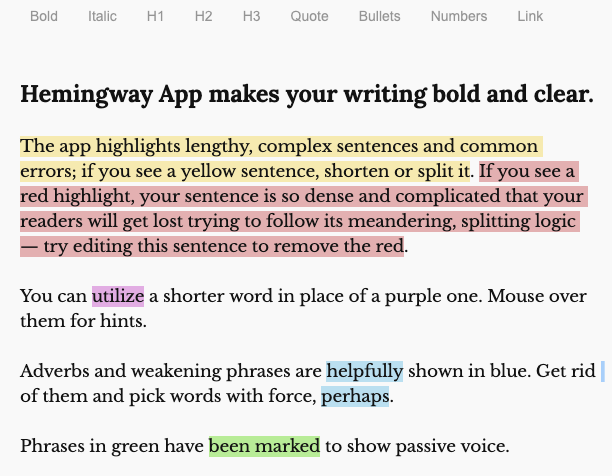
Readability tool
Easily one of the best tools for evaluating readability, Hemingway Editor is free to use. It’s most helpful feature for proposal teams is the sentence length warnings: it highlights long sentences in yellow and extra long sentences in red.
Media tools: Images, videos and graphs
Tool for proposal videos and links
Adding videos and links to proposals only scratches the surface of what RFP360 can do. Inside the platform you’ll find knowledge library, proposal automation, collaboration and reporting tools.
Free stock image source
Access to more than 1.8 million images is just a click away. Pixabay offers free downloadable, high-quality photos. Each image includes the artist’s information as well as any required attribution.
Graph and chart tool
Canva is an approachable design tool that anyone can use. One of my favorite features to recommend is their graph maker. With simple inputs, you can create modern, customized charts and graphs that enhance your brand.
Inclusion and accessibility tools
All the latest on inclusion
The Conscious style guide is a centralized location to find all of the latest articles and educational materials about inclusion. The site offers topics to get you started, or you can simply search for information if you have a specific question.
How to use color blind-friendly palettes
Another great tool from Venngage, this guide explores everything you need to know about color blindness. In addition to providing background information, it offers easy ways to put it to practice.
Color contrast checker
Quick and easy to use, this checker from Coolors is great for ensuring your digital are easy to read for those with low vision. Simply insert your background and text colors and get an automatic visibility score.
How to add alt text to a PDF
If you submit proposals as PDFs, be sure to check out this guide from Adobe to adding alt text to images and graphs. Alt text enables people with a visual impairment to hear a description of the image.
Review tool
Real-time grammar feedback
Grammarly is a helpful tool available as a Chrome extension or a standalone web app. If you install it on your browser, you can see real-time feedback when it detects a potential error.
Additional proposal topics and resources
Proposal best practices are constantly evolving, but you can get all the latest delivered to your inbox by subscribing to our blog. Just sign up using the form on the right hand side of this page.
If you’re interested in exploring further, start here: